Sure, I like making up measurements, facts and figures as much as the next guy. But when the numbers aren’t real, we award The Boner of the Week! to the most outrageous news I read during the last seven days.
So, I’m researching content last week and stumble across this attention-grabbing headline: Gallup State Numbers Predict Huge Obama Loss.
I’m a political junkie, so I bite on the link.
And it’s our Boner of the Week.
Know why? This chart doesn’t state that the President will lose. This states that the editorial writer (and the board that allowed this garbage to pass as news) is apparently hoping President Obama will lose.
As both of my readers already know, this isn’t a political post and this certainly isn’t a political blog. I’d love to get my hands on a similar graph from the other side (I’m sure they exist). My goal isn’t politics at all. It’s just to teach an important lesson:
Dear Minions,
It’s important to know that professional people use charts and graphs ….err… creatively…. to lure away your money, your votes, or your trust. We can “prove” lots of points with a misleading chart.
What Does This Graph Really Prove?
- The President’s approval rating ain’t high. (alert the press)
- If the election were against his approval rating instead of against an actual opponent, he’d get his ass kicked.
Not quite the hard-hitting news originally implied by Senior Editorial Writer, Conn Carroll (Conn’s name might have been more apropos if it had just been Con).
Let’s Show You a Magic Trick
I’ve asked PK from DQYDJ.net, a charts and graphs wizard and fellow political junkie (AND you WILL get political discussion galore on his awesome site), to build us some clever graphs.
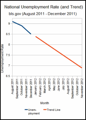
The chart below shows CBO data on unemployment numbers (a hot topic right now and relates to overall financial health of the United States economy). This graph projects unemployment for the next several months.
PK, how about a magic graph from DQYDJ:
Awesome.
Any guesses why this graph is misleading? Use the “comment” section below to fill in your answer.
((PK has included at least FOUR techniques to mislead you here. We’ll show them all in tomorrow’s thrilling conclusion!))
Thanks again to PK from DQYDJ.NET: Personal Finance, Economics, Politics, Investing and the Offbeat for the Night and Weekend Crowd.


5 ways – and the fifth is it ignores the data point of 8.3% for February, released last week, haha. But no, that isn’t one of them.
Good article Joe, looking forward to the conclusion!
Do you think it will be better for liberty if Obama wins again, due to internal conflicts within the government? The last time the Republicans had full control, government greatly expanded… then again, could be the same with Democrats. Where is the option for “No thank you: give me smaller government, please?” 🙂
I have to admit: I’m not interested at all in the politics of the chart. As I mentioned, it would have been more fun to have a chart from the Democrat side because I’m positive they’re rolling out the same baloney.
What I’m really interested in the fact that it displays a lie. Too many lies embedded in charts and graphs.
I’m thinking someone just shifted the orientation of the graph to suit their needs 😉
Sometimes, people are too enamored with the pretty colors of a chart and don’t even pay much attention to the quality of information that goes into the chart. Also, some people are very gullible and believe anything they see and/or hear.
So true, dude. Check out the comments in the linked piece…nobody even talks about the fact that the chart or the headline present an OPINION instead of FACTS. Everyone jumps into their pre-embedded beliefs that didn’t need a chart in the first place….
Kind of goes hand-in-hand with your advertising topic on DollarVersity today.
I saw that headline, and it sounded like “opinion” to me. I didn’t notice the numbers represented approval ratings, which move with the wind.
Your graph above looks like it must’ve come from the Presidents re-election committee.
The data points are too few to predict a trend. Looking forward to hearing the rest of the techniques so I can use them myself the next time I need a loan.
Hmmm….the opinion of the author or the opinion of Gallup?
I heard a rumor PK is secretly with the President’s re-election committee….which is bad news for him tomorrow when we unveil his evil sham….
This is the greatest post I have ever read on a PF blog! I love Where’s Waldo!
1. The Y scale is set large to make the line trend look bigger
2. The time series starts at a decreasing trend to hide all the other junk prior to 8/11
3.Used 4 months of data to predict 8 months of future numbers (at least it’s not a sound from a stats perspective at least)
You’ll dig this shirt, Shaun: http://teenormous.com/t-shirts/We-Got-Him-by-Nicholas-Roberts-by-Threadless-1092390.
Everyone here at my company thinks that charts are the best way to go. Little do they know you can get a graph or chart to say anything you want. Sure mess with the scale and it looks like we are going through the roof with revenue. Sooo misleading.
Next time just put on the circus music while they’re showing the graphs, Christopher! Then tell the graph people you’d like to just see the dogs & ponies next time instead of the smoke & mirrors.