When words don’t work, I’ll emulate my buddy PK at the DQYDJ blog and resort to graphics when explaining your investing options. Since I can’t personally be bothered to create any type of creative chart, I’ll instead use a graph that I received from a friend.
Before we peruse this particular investing chart, I should introduce it, like a big star explains the movie clip:
People worry often about risk when investing. You should. It doesn’t make sense to risk your portfolio without knowing what type of return you’ll receive.
As an example, one of the riskiest investment classes is art. I know and you know that your dogs-playing-poker is probably a timeless classic, but beauty is definitely in the eye of the beholder on that one. Unfortunately, if you paid $10k for your Velvet-Elvis-and-the-Eagle rug, that’s probably considered a capital loss.
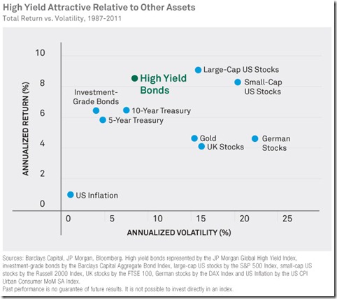
Here is the risk/reward profile of high yield vs. other asset classes:
People are generally shocked when they see the risk/reward profile of high yield bonds. Is it true that JUNK BONDS are significantly less volatile than large-cap stocks?
Yup.
High yield bonds aren’t much more volatile than 10-year treasuries (which, ironically, have been more volatile than investment-grade bonds)?
Yup again. I knew people who came to this website are flippin’ brilliant.
Maybe now is a good time to review my posts last week on the topic of high yield bonds:
Off topic: Check out German stocks. Lots of volatility, plus those people wear black socks with sandals. I don’t know what those two points put together says, but it sure feels awkward.
How about you? Does this chart surprise you? Can you see my love affair with high yield? Make you laugh? Improve your outlook on life?

