Today is Part II of our discussion on charts and graphs. For Part One, you’ll want this link to:
Boner of the Week: Have You Been Lied To By Charts and Graphs
Sometimes, before jumping into an argument on how you feel about data presented in a graph or chart, it’s a good idea to focus on whether the data presented is actually showing you something truthful.
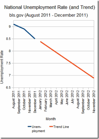
Our friend PK at dqydj.net (which is a fantastic blog on economics, politics and investing), helped us out with his wizard-ly chart skills and created a graph that hid four lies.
Here it is again:
There are FOUR lies PK is telling in this graph. Did you guess all four?
Okay, let’s reveal them:
Lie #1: Long Trend Line
Marketers are funny. They’ll draw some pretty long-range conclusions from very short term data. That’s true in this case. PK has taken the general line from October 2011 to December 2011 and—as if using a ruler—decided the next several months would follow similarly.
How does this apply to your financial picture?
– According to Bloomberg Businessweek, the stock market has had it’s best run in 23 years to begin a year. It’s a mistake to think that less than 40 days of good news will create 365 days of stock market bliss.
– Often, government statistics are revised. Basing any financial move on short-term and possibly short-lived data could wreak havoc on your financial life.
Lie #2: Small Sample Size
Check out PK’s graph again. He’s basing the entire graph on FOUR MONTHS of data before he gives you the equally tragic long trend line. In politics, where trends seem to change every three minutes, people often draw conclusions about an election many months into the future based on short term data:
– After Huffington Post (among others) reported on Rick Perry’s quick surge in the polls, articles such as this one that appeared in The New Republic—declaring that Rick Perry is going to be hard to beat—dominated editorial pages. There were only 15 days between the Huffington Post “surge” article and the “he’s probably gonna win” New Republic story. I wonder if any of these writers ever go back and read how reactive this seems several months later? Probably not, because using a small sample size to predict future results sells subscriptions.
– In the financial world, marketers of securities predict the bottom of an investment based on short-term data. It also holds with bloggers. Check out these predictions from the website Trading Authority. In the commentary, the “expert” uses short term data to predict an upswing in these stocks, predicting they “Could Jump 50 Percent”. Wow! Sounds like returns I’d love to have in my portfolio.
How did he do? Let’s look:
| TradingAuthority Predictions on 6/3/2011 | |||||||
|---|---|---|---|---|---|---|---|
| Ticker | Price 6/3/11 | Price 2/5/12 | Change | % Loss | |||
| SCHW | 16.76 | 12.74 | -4.02 | -24% | |||
| WFR | 9.64 | 5.39 | -4.25 | -44% | |||
| GHL | 51.55 | 47.61 | -3.39 | -6% |
Ouch.
These results weren’t graphed, but both the “Rick Perry is Uncatchable” and “These Stocks Are Going to the Moon” cases could easily have been presented to an unaware public in chart or graph form to make a bigger (untrue) statement.
(By the way, finding this site wasn’t hard. I just performed a Bing search for “Upturn in Stock That Failed” and clicked on the first link that matched what I was looking for.)
The point? Don’t take short-term results and use them to predict long-term trends.
Lie #3: X Axis Compression
If you want to take fairly small results and turn them into “Wow!” returns, just compress the graph. Look at how thin PK has made this graph by squeezing months together across the X (bottom) axis. That “black diamond super difficult ski hill” drop would look more like a “bunny hill” if he’d stretched the graph across the page. Since your eye is drawn to the slope, a skilled marketer will change the degree of descent to reiterate whatever point she’s making.
Lie #4: Y Axis Stretch
Similar to lie #3 above, marketers will stretch data across the Y Axis (up/down) further to prove that there is far more movement than there truly should be.
– Beware people showing a stock “bouncing around” and then showing a chart which stretches the distance between prices.
– Remember, the inverse is also true: If a marketer wants to show a position as safe, they’ll compress the numbers to reduce the perceived volatility.
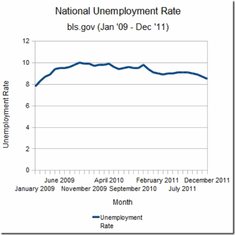
Here’s the Actual Chart PK Started From
The actual Bureau of Labor Statistics-derived chart has little in common with the “trend” chart we displayed above. But because PK wanted to show you quickly declining unemployment, he was able to manipulate this (true) graph to create a very, very wicked lie.
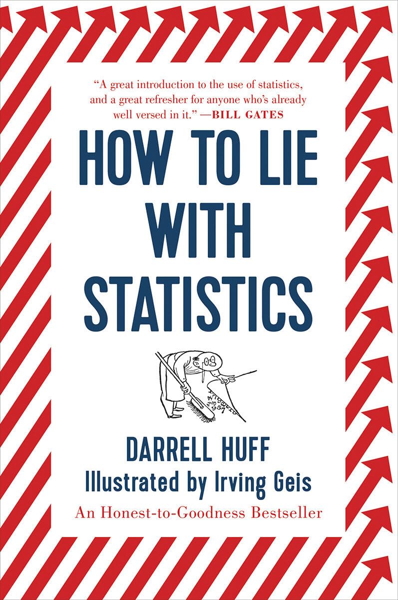
Want more on avoiding manipulative charts and graphs? Try this book: How to Lie With Statistics – get it for $7.44 at Amazon.
Okay, that’s my story, now it’s your turn. Have you had to create graphs you knew were “untrue” in your work? Have you been presented with graphs that weren’t completely accurate? How many of PK’s tricks were you able to find before reading today’s post?
(I’d like to again thank http://www.dqydj.netfor his help on this two-part series. I wish I had his ability to show timely and accurate charts like he and his partners have at dqydj.net. For more great charts, graphs, politics, economics and investment discussions, visit his website.)


